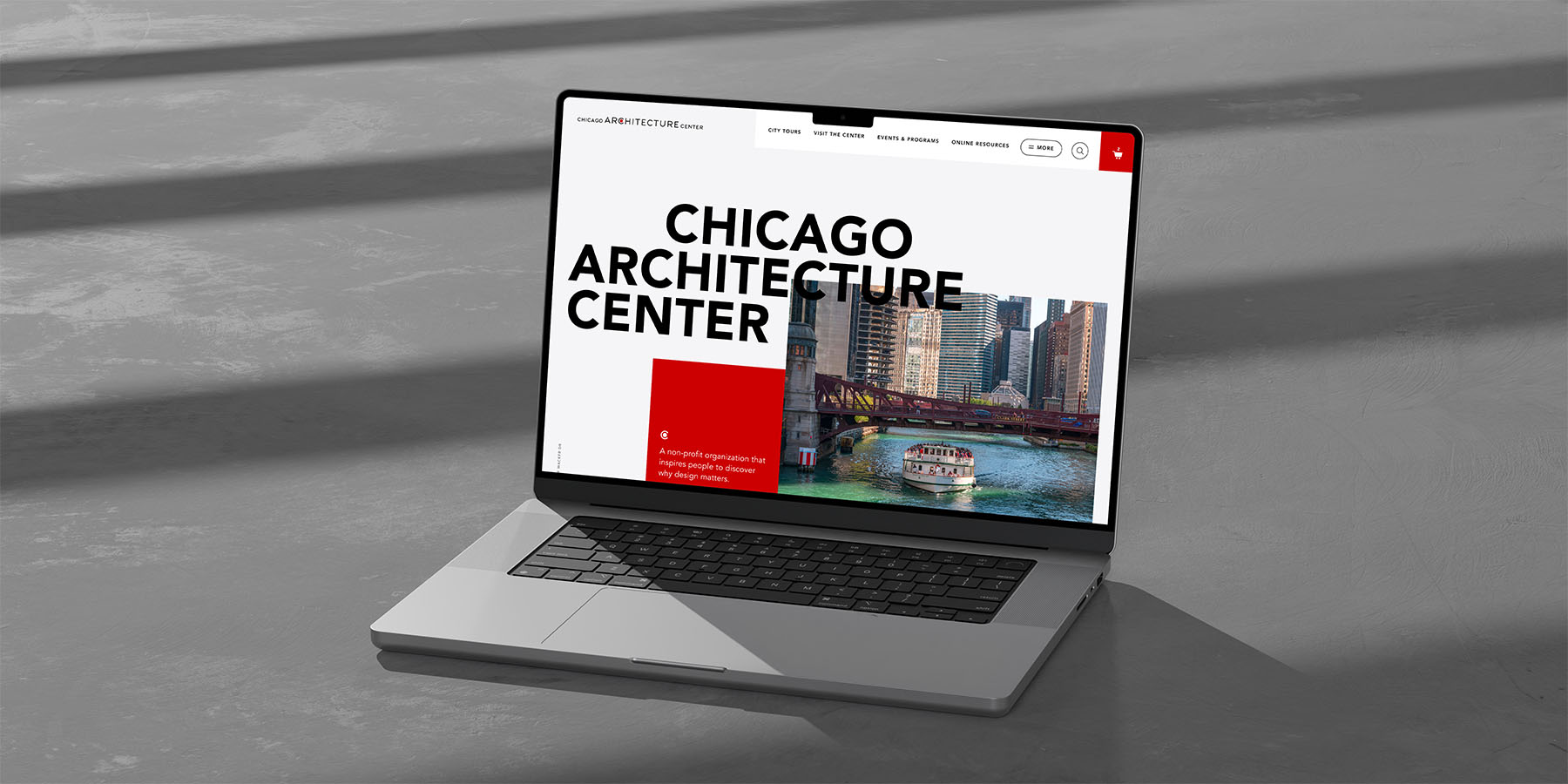
Chicago Architecture Center Website
Client: Chicago Architecture Center
Duties: website ui design
Known for their top rated river cruises, the Chicago Architecture Center also offers much more as a cultural institution in the city. A large part of the redesign was focused on a content strategy to drive traffic to the center as well as the other tours and educational programming CAC has to offer. My goal was to build on what was created in the wireframe stage to be able to give a more thoughtful design approach where necessary to give extra visual appeal.
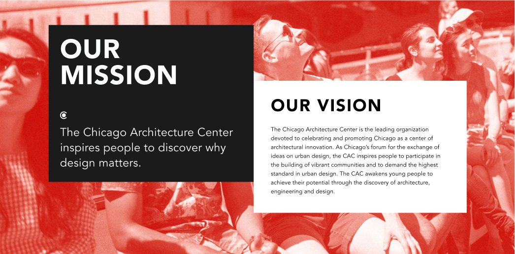
After a look and feel of most of the homepage was approved, my duty was to build on the design-related objectives. The first being to create a site that would sit as a design piece on its own that emphasized the CAC's mission statement of helping people discover why design matters. The second being situating them as an institution with equal standing to other large cultural institutions in the city, all while still being friendly to a broad audience.
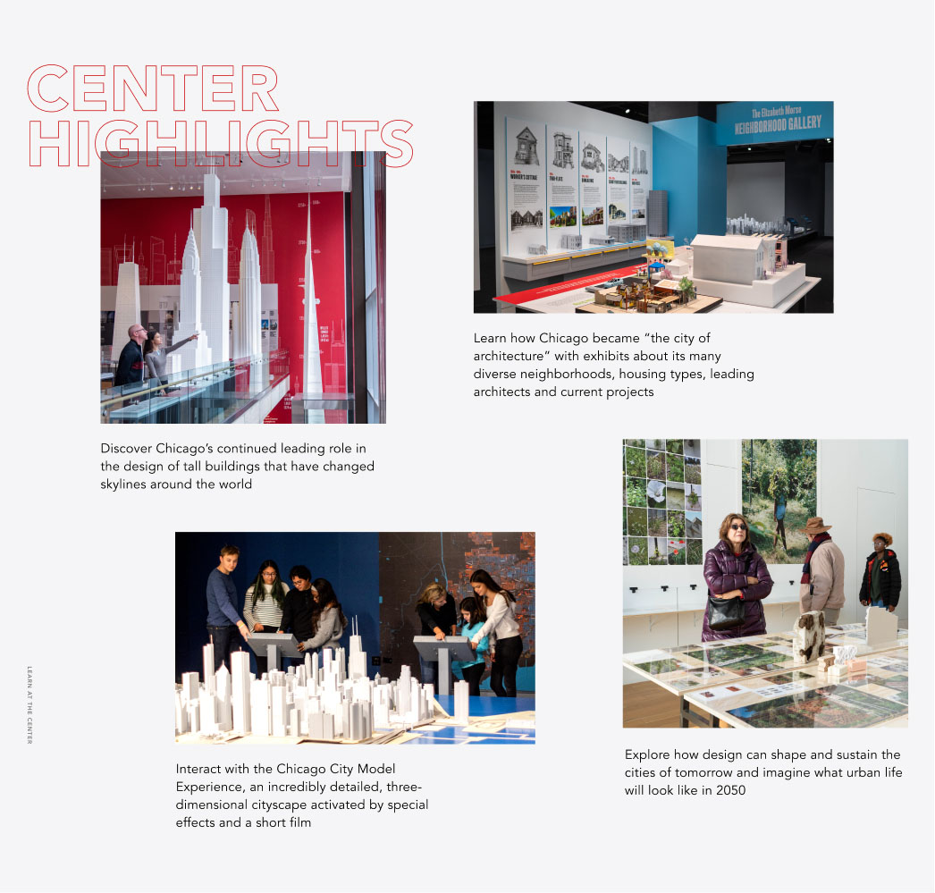
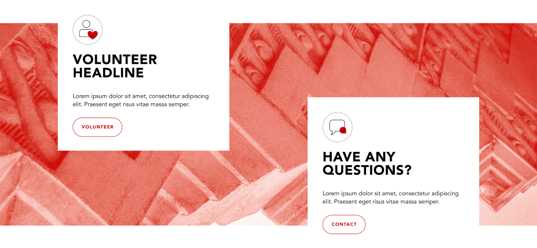
A key point in the design stage of this project was balancing creating interesting components that could be reused for a variety of content as well as seeing opportunuties to create more unique designs to emphasize elements of the Center and its mission to call out important information by giving it more visual interest.
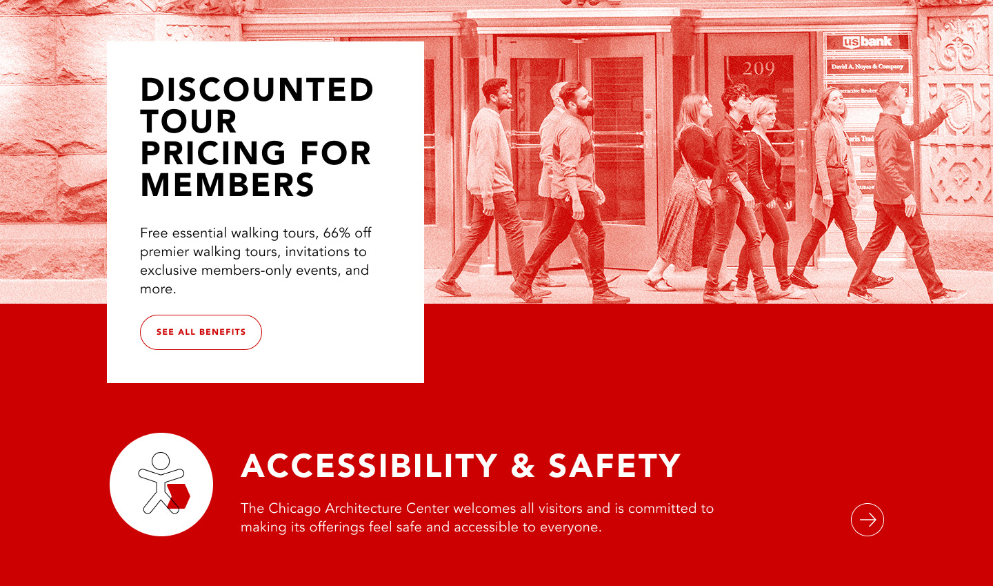
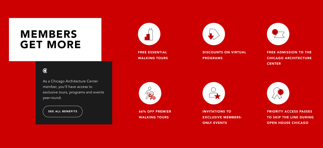
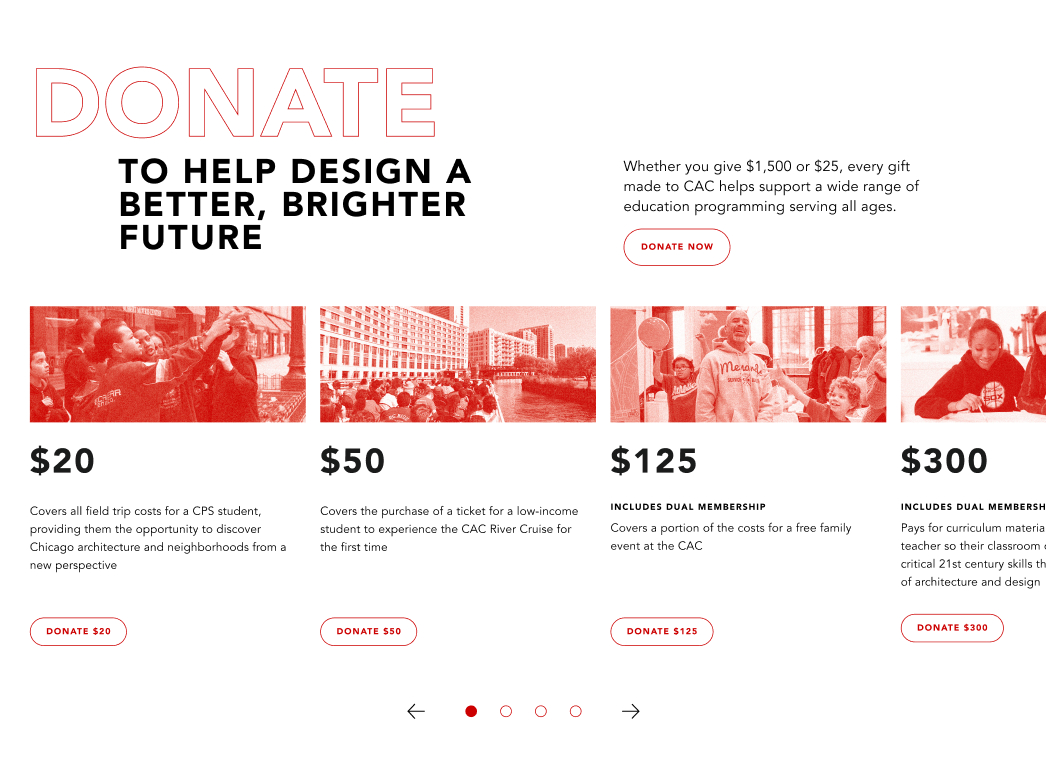
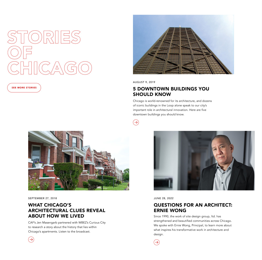
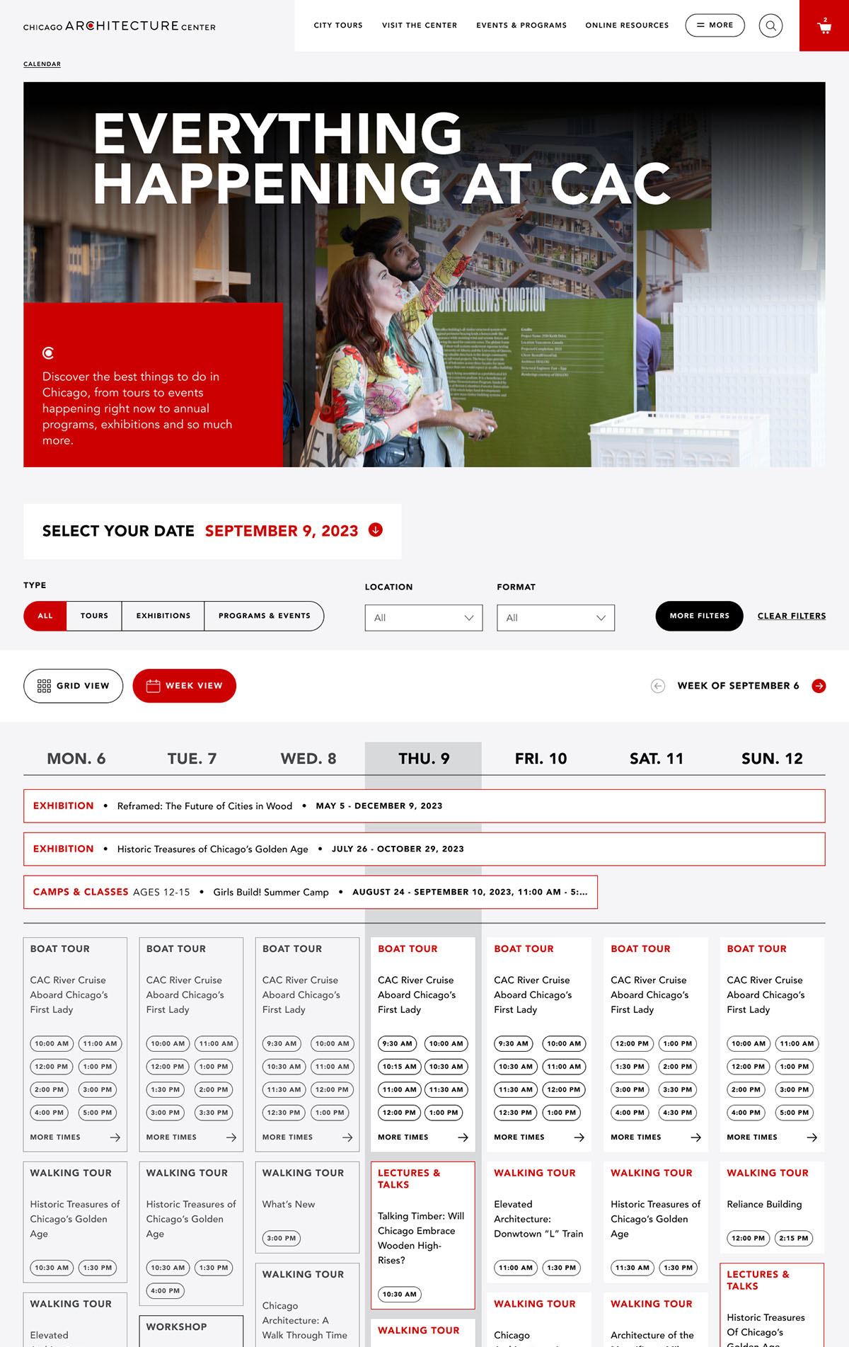
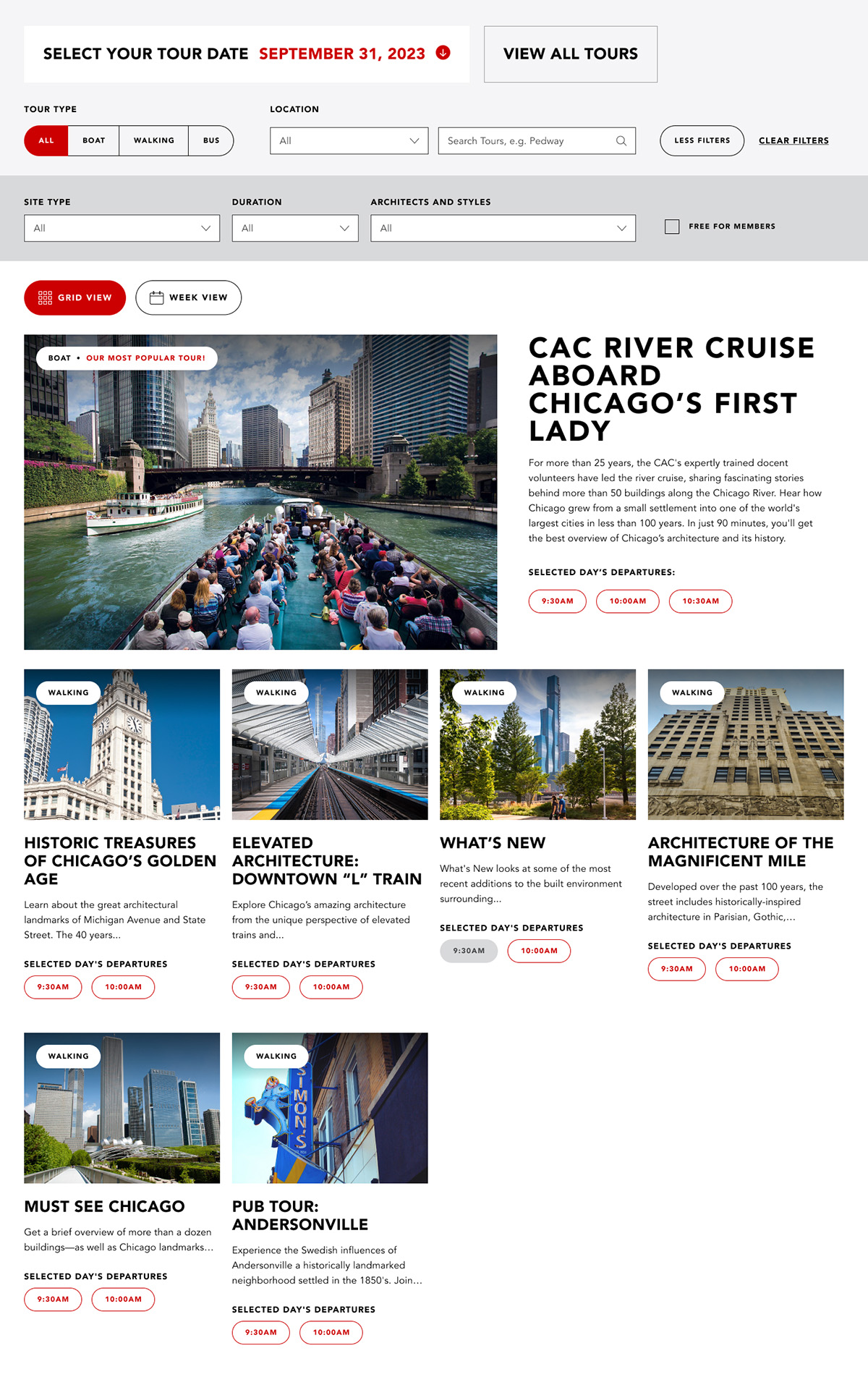
With so many tours and events available, aside from providing filtering, creating a more comprehensive overview of the Center's offerings was an important addition to the redesign.
A week overview of events was an effective way of giving a glimpse at what events were happening but had the potential to be chaotic with multiple events and a boat tour that has many departures. While the keeping the times in a button format had to potential for extra visual clutter, keeping the same design format used in other applications maintained visual cohesion across different applications.
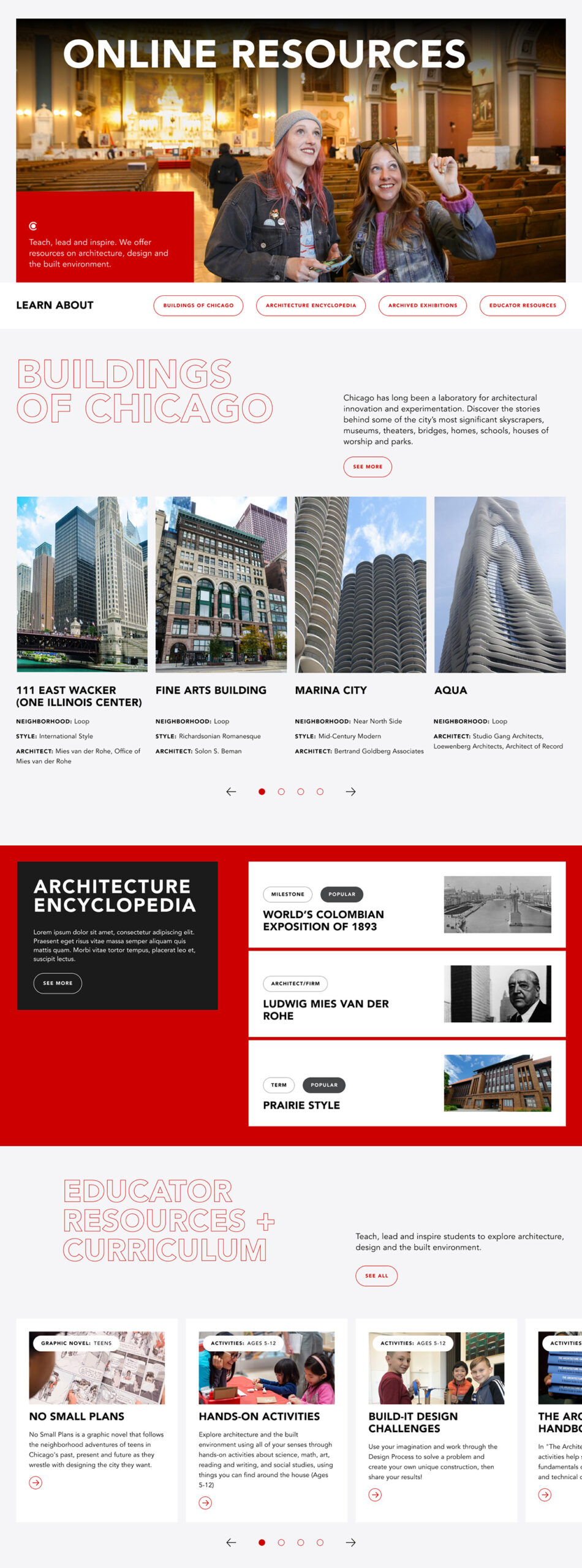
CAC also provides educational resources for those interested in learning about architecture in general as well as architecture within the city.
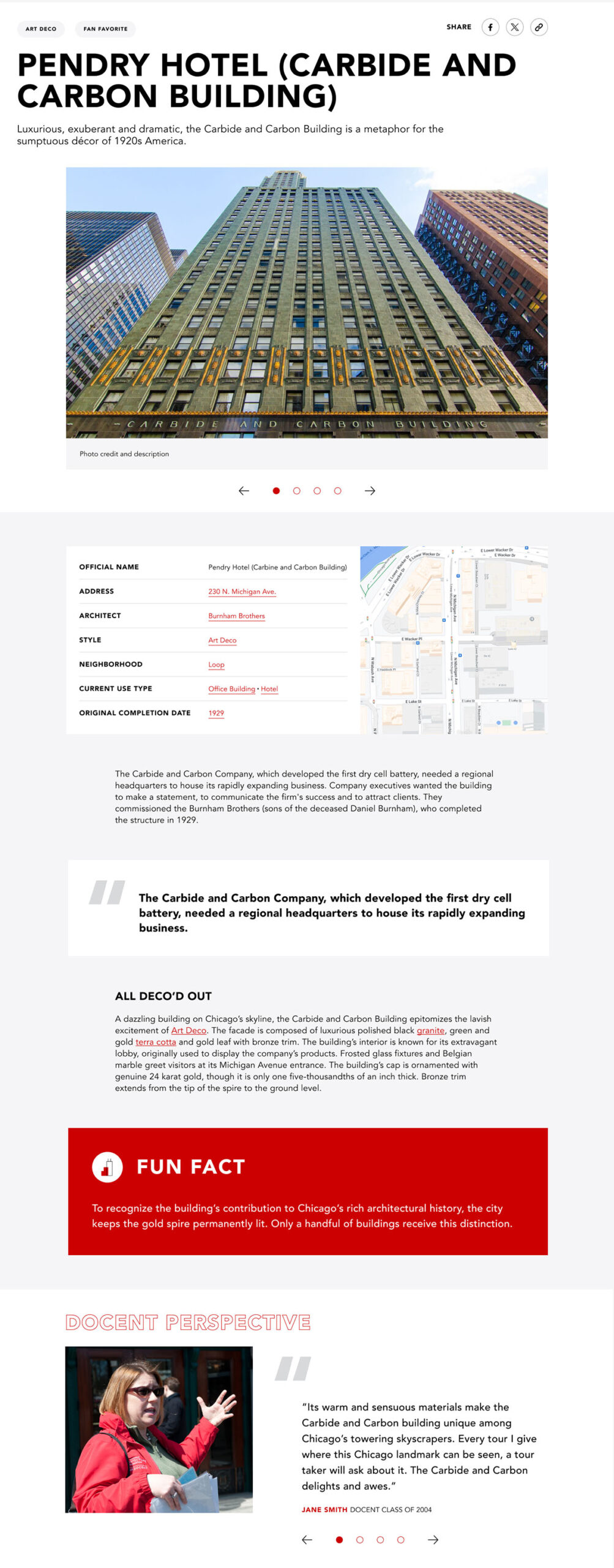
Along with prodiving a clear and visually interesting page outlining the available resources, it was important to add some emphasis on elements designed to break up what could be long blocks of text. That includes a bold callout for short factoids as well as an area from insights from the docents, a backbone of the Center.
Hey!